
If you're currently looking for a new job, the first thing that comes to mind is what to wear. But what about your resume? After all, it may be the first impression an employer will get of you. One way in which employers judge resumes is by font size and font type. This article provides information on how to choose the best fonts and sizes for your resume, so that you can increase your chances of getting hired.
There are two main reasons why your resume font matters. First, your resume is a document for humans, not machines. As a job seeker, you want to ensure that the design of your resume will pique the interest of those who read it so they're thinking about what you can bring to their organisation, rather than being hung up on poor font choices. Use a font that's both readable and professional-looking.
Another challenge of using different fonts is that HR professionals relying on applicant tracking systems (ATS) cannot read some fonts as well. ATSs are programmed to read resume documents in a certain way to focus on the content and ensure they're organised accordingly, so resumes need to meet compatibility standards if they're seeking greater exposure through these programmes.
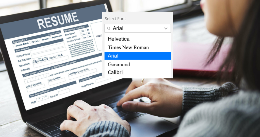
The best fonts are those that have a classic look and feel, make your resume easy to read, and enhance the design. There's no "perfect" font because it will be up to the employer's personal preference. However, there are some excellent fonts you might want to consider:
Now that you have a few guidelines about the traditional fonts and some basic considerations, avoid using any heavily stylised fonts, narrow condensed fonts or light versions of your chosen font. Also know that non-standard or downloaded custom fonts are to be avoided because they can make potential employers think you're not detail oriented, which may affect whether they hire you for a position. You should avoid these fonts when creating or updating your resume:

When considering resume font size and length, it's important to strike a balance. "Too large" of size can result in writing up the entirety of your experience on one page without necessarily having the years of experience to back up that resume length, whereas if you go too small, recruiters may not be able to read your resume and will likely put it in the no pile.
Most experts agree that 12-point font(pt) size is good for resumes since employers can easily scan this type of text quickly without affecting readability. Others recommend using 11-point font size with Arial or Helvetica as the fonts on your resume if you're applying in corporate settings where conservative
Your name, heading and subheading should all have different font sizes to help create a composition that will catch employers’ attention. The best rule of thumb for these three elements is as follows:
However, these are not the only factors that contribute to a resume’s font size. You should also consider whether your name is in all caps or mixed case. For example, if you have an unusual last name with letters of varying heights (i.e., RyLeeo Chan), then it may be advantageous for your first and last names to be at least 14pt so they will stand apart from each other better on the page. Similarly, there's no point using 11pt font sizes for subheadings when 12pt would do just as well without sacrificing readability. In general, larger fonts give more authority to written content but make sure that such formatting doesn't come across as too aggressive or "in-your-face."
What kinds of fonts fit all these considerations? Put simply, the classics: The fonts that come standard across a range of programmes, and aren’t overly flashy or designed. These fonts became standard because they’re easy on human eyes, and since they’re standard, ATSs are programmed to read them.
Sometimes employers will want really specific information from a candidate's resume including which schools he attended, what degrees were obtained and where previous places of employment were located; therefore if these items are important to you, then it's best to use bold font.

It's typically not a good idea to use underlined text in your resume because the reader might mistake this for links that need clicking, and will be disappointed when they're only words without any other content attached.
Since recruiters can read resumes quickly, go ahead and make sure all of your resume's items are easy to scan by using no more than two fonts at one time – with both being serif or sans serif fonts – and keeping headings short but descriptive as possible. Keep them succinct too. If you're looking for something with fancier typography, try incorporating graphic elements such as icons rather than elaborate headers.
When it comes to picking a font for your resume, there's really no right or wrong answer. Which one you pick will depend on personal preference and the message you want to get across with your resume.
Consider whether a serif or sans serif font might work better for you. Masculine, modern fonts like Arial and Calibri are likely to be more popular with prospective employers, while more conservative fonts like Times New Roman and Georgia can help make your resume look traditional and trustworthy.
In order to identify the type of font you're seeing, note if the lines attached to the top of a capital T are short lines or not. If they're a single straight line across, it's sans serif. If there are shorter hanging lines, it's most likely serif. When deciding on the typography for your resume, pick a font which is aesthetically pleasing to you.
While the research might sound daunting, you can create a resume that's visually appealing by sticking to these classics.
For example, you should use a bold and italic font or emphasise job titles with color to add visual interest. Underlining headings is usually unnecessary since people read underlined text as links to linked content.
In addition to choosing typography that's readable, your content should be visually pleasing. Use two fonts: one for headings and another for the body copy. More than two font combinations will start to distract the reader.
It's always important to make sure your resume looks clean and neat. This ensures that you will be able to maintain easy scanning which, in turn, makes it more likely that a recruiter will read the entirety of your skillset. The last thing anyone wants is for their resume to end up at the bottom of a pile because they used an unreadable font; don't do this inadvertently.
Choosing the right font is a big decision when it comes to your resume. You want to make sure that you're being clear and concise, but at the same time, you don't want to lose out on potential opportunities because of unreadable text. To keep things short and sweet – consider using two fonts: One for headings, and another for body copy. In addition, choose typography that will be visually pleasing without distracting from important information in an employer's eyesight or making them think they have clicked on a link instead of reading text.


